Problem:
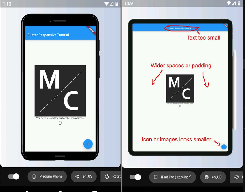
Let’s check how the UI look if it’s not responsive, I’ll be using the flutter starter project but with additional image logo at the center to further see the problem.
Additionally i’ll be using device_preview package to easily test our layout in different screen size in just a single emulator or device.
Add the device_preview package in pubspec.yaml
dependencies:
  device_preview: ^0.5.5
Device preview code usage:
main.dart
void main() =>
    runApp(
      DevicePreview(
        enabled: true,
        builder: (context) => MyApp(),
      ),
    );

class MyApp extends StatelessWidget {
  @override
  Widget build(BuildContext context) {
    return MaterialApp(
      title: 'Flutter Responsive Tutorial',
      theme: ThemeData(
        primarySwatch: Colors.blue,
        visualDensity: VisualDensity.adaptivePlatformDensity,
      ),
      builder: DevicePreview.appBuilder, // Add the builder here
      home: MyHomePage(title: 'Flutter Responsive Tutorial'),
    );
  }
}
Layout comparison using Device Preview:
Solution:
Common scenario when dealing responsive UI in flutter is by using MediaQuery and detecting device orientation but this could make your code bloated. Good thing there’s a very nice and easy package to use to deal with this problem that also works well with device_preview package and it is called responsive_framework.
Add the responsive_framework package in pubspec.yaml
dependencies:
  responsive_framework: ^0.0.14
Responsive framework code usage:
main.dart
class MyApp extends StatelessWidget {
@override
Widget build(BuildContext context) {
return MaterialApp(
title: 'Flutter Responsive Tutorial',
theme: ThemeData(
primarySwatch: Colors.blue,
visualDensity: VisualDensity.adaptivePlatformDensity,
),
builder: DevicePreview.appBuilder, // Add the builder here
home: MyHomePage(title: 'Flutter Responsive Tutorial'),
home: ResponsiveWrapper.builder(
MyHomePage(title: 'Flutter Responsive Tutorial'),
maxWidth: 1200,
minWidth: 480,
breakpoints: [
ResponsiveBreakpoint.resize(480, name: MOBILE),
ResponsiveBreakpoint.autoScale(480, name: TABLET),
],
),
);
}
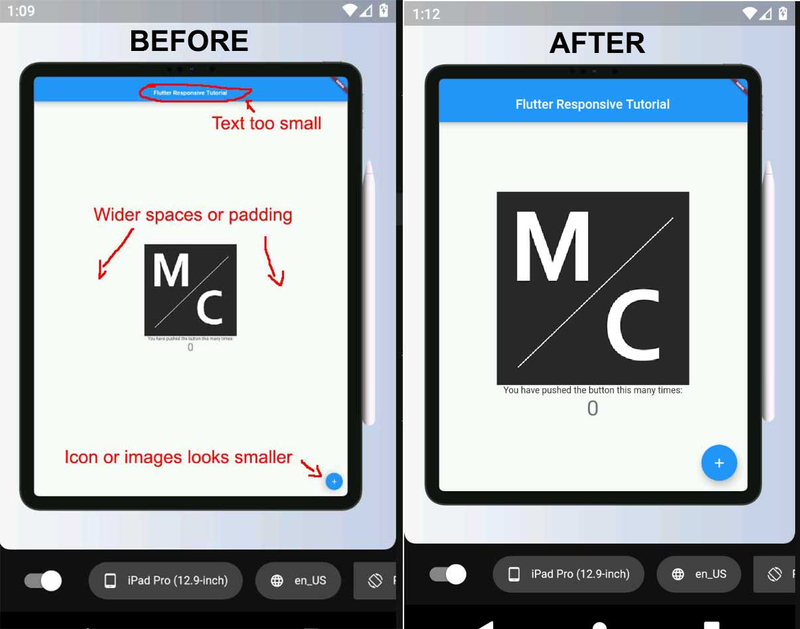
}And voila! We’re done! Very easy right?
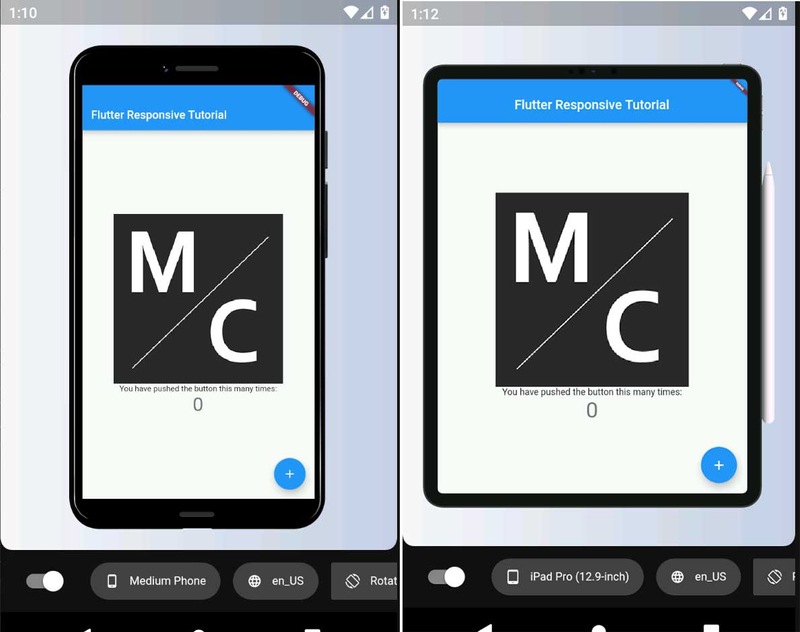
Layout comparison using large screen:
Tips:
Orientation: Wrap your widgets using SingleChildScrollView to avoid overflow issue when orientation changes.
Image: Use AspectRatio when you want the image to resize inside a container or card instead of using width and height. It should fit perfectly even when orientation changes.
Github Link: flutter_responsive_tutorial.
Package Issue:
Responsive framework package is not perfect and got some bugs. One bug I encounter is with hero animation but it is not that app breaking for me so it still better than having bloated code for different sizes and orientation. You can file an issue to the developer’s github if you encounter an issue.